Showing posts with label Concept. Show all posts

Thursday, January 17, 2013

A bit of a dissapointment - Part 3

I've felt the planning stage was ready to start blocking out the main shapes of the scene.
I have looked at several tutorials during the Christmas break and have been constantly learning new things since.

The aim is to stick to the business plan I've developed. Until now, I have watched the following tutorials:

3DMotive.com:

  1. Asset Workflow: The Briefcase
  2. Workflow Series: The Treasure Chest
  3. Texturing and Baking with ZBrush, xNormal and nDo 2
  4. Baking Normal Maps: Tips and Tricks
Digital Tutors:
Eat3D:

Gnomon Workshop:
  1. UDK: Part 1 - User Interface
  2. Creating a Simple Level
This may seem quite a lot and yes... I did spend quite a few hours in front of the screen. Instead of watching films when going to bed, I've put in a tutorial and continued watching it the next morning. 
I've learned a great deal and have started to get a clearer picture on how I want to plan my workflow.

For this competition, the first thing I am going to use which I've learned from several of these tutorials, is a blocking out approach. First, I will use very very basic shapes to block out the main shapes of the scene.
This will help me to adjust the scale, the position and angle of several objects before they are detailed. It's much easier to build up your scene this way, because if you want to change something, but you have already added some fine detail to it... it's going to be a pain.

First blockout:


It started to shape out just fine and I am going to skip ahead to the very last version of the blockout I have gotten to as the disappointment was ever close.


I've started using ZBrush to add some detail to my most important shapes. This is part of the blocking out stage, I wanted to see how these will look after textures and depth information will be painted into them.
The structure was coming along nicely as well.. I did feel there was more work with it.. that it was still lacking something, but I felt confident that I was on the right track.

One issue was time: I had 2 days to finish this entire scene and I felt I could really quickly texture the entire scene. The slap to the face came when I read through the extended rules of the competition, which states that  only students studying in the U.S. or Canada are eligible to enter. 

Well... this was really heart braking to read.. and after having put this much effort into it.... I smiled! :) 
I smiled because I felt that I did not lose anything, on the contrary. Yes, it is very sad that I can't get some exposure, but this project pushed me so much to learn new things and to actually do some professional reference gathering.

I have been suggested by the previous winner of the contest, Jessica Dinh, to post this work up to the Polycount forums and keep on working on it. There are a lot of Blizzard artists checking those forums, so I will still be able to get exposure for my work.


But, I felt that with 2 days left, rushing through the texturing and rendering stage would not be the best thing. I would not learn much and I would not be able to bring the maximum out of this concept. I've decided to keep this scene as a test base for the new things I learn. I have a vast list of tutorials ahead of me and I need some sort of test scene which I can practice on and with.
I was thinking of importing this environmental piece into UDK, but that requires more learning as, right now, no proper importing could take place... just messing about.

Wednesday, January 16, 2013

A bit of a disappointment - Part 2

Having looked at Sekler and Romanian architecture, I did not come up with anything that would be unique enough for the environment. I've decided to do an extensive search on the internet on whatever I can find from the medieval ages.

Looking for reference is not just about finding something that perfectly suits your expectations and then "just" copying it. As you look through hundreds and hundreds of images your image library starts to build up. By this I don't just mean a library on the computer, but inside your mind as well. Your imagination starts to widen and quite often I've found myself coming up with new things by looking at something that already exists. Reference images can ignite one's imagination to think of something new and that is an important trait to have.

I have found a vast number of images.. literally. I've gathered about 600 in total, which I will not put up here. I've also checked some concept art websites as well and in the end came up with a smaller library composed of the images that I can inspire something new from:


I really got hooked on the bat theme and the idea of actually making a structure look like a dragon is imbedded into it inspired me even more. I also like these impossibly narrow cliff formations, which then widen out, offering a planar type of surface. Of course, this is all impossible in real life, but the beauty of CGI has always been the possibility to make the impossible look actually believable.

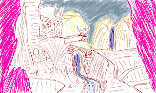
I began drawing a basic concept of the building I was after:


Concept of the environment:


Friday, November 23, 2012

Test renders

I have used Photoshop a lot of times to blend an Ambient Occlusion render together with the original to see how the small details look like. This is to get a glimpse of the final affect all the little cracks, nudges etc. have on the image.
Also, PS was used to adjust colors and lighting as well with the help of tools like Curves so I can get quick results right in Photoshop without rendering in 3D.


Slowly, I start adding color here and there, being very careful at this point. I want to get a good foundation upon which I build the rest of the textures. My aim is to shade the main gate structures and the building on the right, because those are the biggest objects in the scene. The shading of those will drive the shades of other elements, so I have paid extra attention here.
This is an early test render of those textures applied:


Here are some of the assets that populate the scene:


Wednesday, November 21, 2012

Timeplan and first block outs

With the referencing part pretty much finished, I wanted to create a time-plan for myself so I can track my progress and always know where I am at. I have a deadline and I have a journey leading up to that, so I exactly know how I'm doing.

Week 1

- Complete the main block out of the scene
- Create everything from the asset list and possibly add more if needed.

Week 2

- develop textures
- develop lighting
- create multiple test renders/iterate and play with the settings to achieve a final look

Week 3

- animate
- optimize the scene for animation rendering
- create final tests
- render required passes
- composite/post-process in After Effects

Here are some of the earliest blockouts where the aim was to try and match the scale and proportions of my concept. The very first test render showed that I did not understand a thing or two about the layout, so it was good to see some errors pop up at this stage and not later when I`m already in the detailing stages. Making global changes could have been very destructive.


Sketching, writing asset list

Upon reading some of the lore regarding the city I have found out the following:

- the blood elves which inhabit the city are obsessed with arcane magic. They have a massive hunger for and the obsession is sometimes too much to handle.
- they use magic in a lot of their architectural elements. Many building are held together with the help of magic. You can see floating pots and flags as well, which are the cause of this as well.
 - the city follows the natural topography of the landscape, thus it blends in nicely. This is not just in the shapes, but in the colors as well. You can see a lot of trees that have the same color palette as some of the structures.
- the city is full of foliage: flowers, bushes, trees etc.

I`ve sketched down 1-2 drawings:


Based on the research and reference images, I`ve compiled an asset list and put them intro logical groups:

Gate structure:

- Gate main building
- 2 towers at side
- balcony
- big wall bricks
- bridge + its sides

Gate structure

Inner Room:

- Kael'thas statue (human statue at entrance)
- Inner walls
- decoration
- floor
- flags
-block below statue
-fireplace

Inner Room

Right building:

- big bricks
- arc shaped top
- decorations
- rooftop block
- support tower

Right building

Environment:

-terrain
- trees (5 type)
- bushes (4 type)
- lamps
- benches
- flags with support
- cobblestone (bridge, terrain road and inner room)
- fireplace (near entrance)

Environment

Bacgrkound:

- all the towers and the right building top will be used to simulate a big city behind the gates


Creating the color palette

Creating a color palette is not something that I call as a habit, as I have never really went ahead and created one for my previous work. I was aware of the color scheme I would use, but I never really put it down onto paper or a digital sheet. I will change that with this project and will study the colors I will use in detail to make sure that I re-create that Silvermoon feeling and atmosphere.

The scene will be dominated by shades of orange which you will mostly see in the architecture. To break up the dullness of one color dominance, I use red for assets like the flag and striking yellow on its logo. This will bring more contrast to the image, thus making it more interesting for the eye.

The vegetation will consist of all kinds of colors. The bushes and the grass on the terrain will have shades of green, but the trees have different colors. The trees found on the bridge leading towards the gate have a whitish bark and yellow leafs. The other trees found on the ground have the same bark, but the colors vary for the top part. All of them have a gradient behavior, meaning the leafs start with color A on the bottom. As you go up, the color transitions to color B and then on the upmost part color C.

The architecture will have a certain amount of white in them as well and the crystals found on the flags near the bridge have a blue glowing crystal. This is very handy as I can further break up the boring red/orange monopoly and bring more contrast next to the green.

Tuesday, November 20, 2012

Planning, researching Silvermoon

"Silvermoon city is the capital of the blood elves. Te city was constructed out of white stone and living plants and interwoven with the natural topography of the landscape".

I've created a production roadmap, divided into logical sections:

Research/planning

- Gathering reference
- Reading about Silvermoon
- "Playing" World of Warcraft and looking at the city first hand
- Blocking out drawings
- List of assets
- Designing the color palette

3D phase

- Blocking out the main shapes to achieve proper scale and ratio between objects (3DSMax)
- Test lighting
- Modeling details in ZBrush
- Texturing in ZBrush
- Unwrapping in 3DSMax and Headus UV Layout
- Map baking in XNormal
- Adjusting lighting to blend nicely with textures
- Baking out LightMaps
- Animating
- Rendering Passes

Compositing/Post-production

- Combining render passes in After Effects
- Adjusting colors, levels, adding effects with MagicBullet
- Adding intro and outro with After Effects
- Render out final animation

So, to start out, I've gathered some reference pictures of the gates of Silvermoon. I have also went in-game and took screenshots of important elements:


Saturday, October 27, 2012

Choosing the concept

Based on the research I have done, it became obvious to me that each job application I will hand in has to be tailored to that specific position. The portfolio needs to show that I am aware of that specific company's art style and other requirements. For instance, if I want to apply to a game developing company that specializes in car racing games then my portfolio has to show that I can create outstanding race tracks and the surrounding environment.

I am a huge fan of Blizzard Entertainment's games, so it makes sense to start creating work that matches their style. Although, I did create one work before which was based on one of their concept drawings: my "Haunted House" image. Because of this previous Warcraft work, I have already some experience and understanding of their own, unique style. Now, I plan to further that knowledge, hoping that one day it might just get me that desired position.

I was aiming for an area of their "World of Warcraft" game that is rich in color, has all sorts of interesting shapes and textures as well. I am a huge fan of creating architectural pieces, so it got me thinking that I could re-create one of the many cities found within the game. Their cities have barely been re-created in realistic CG as well, so this might even be interesting to the Warcraft fan community. I know for a fact that everyone's craving for more, realistic representation of the scenery found within the game, but this need has barely been satisfied.
The game's graphics (due mostly to the aging game engine's limitations) is not exactly the most realistic thing you ever saw, although that has never been the goal with Blizzard. They always value style and feeling over realism, but it never hurts to try and keep that specific style and try to blend it with the more modern technical opportunities available today.

That said, I went ahead and posted a thread on the biggest World of Warcraft community out there, MMO-Champion.com. I have asked the fans which city they would be most interested to see and I had suggested my top 3 favorites, which was Silvermoon, Stormwind and Dalaran.

Out of these two, my favorite so far was Silvermoon, due to it's strikingly emotional color palette. As you can see on the images, it uses all different shades of red, orange, soft white, brown and it even has vegetation which gives it's visual style good contrast.

Silvermoon
Silvermoon


Silvermoon
Silvermoon


Stormwind was appealing because it's just pure, human architecture with a bit of twist added to it. Warcraft style is all about non-linear, unperfect curves, shapes etc. I am really inspired by the medieval architecture style and all its details and adding that extra style to it, makes it all the more interesting. Why Stormwind falls behind Silvermoon on my list though is because of it's colour palette. It lacks that extra "kick", which Silvermoon has, because it uses mostly common, "everyday life" colours.

Stormwind
Stormwind

Stormwind
Stormwind


Third option was Dalaran, which is failry similar to Silvermoon. It has these very interesting shapes and silhouettes. It is a blend between human... and maybe a bit of sci-fiction elements. It has that bit of alien feel to it, but you still feel that it's a human settlement. It is also a floating city, above the skies as you can see on the image and it's color palette is very intriguing as well. It mostly uses shades of violet, brown, blue and red.

Dalaran
Dalaran

Dalaran
Dalaran


So far, Silvermoon is my choice but I will wait for some feedback from the community and I will also read up on the history of these cities, as there is rich lore behind all of them. Maybe I can incorporate some sort of story element, or one of these cities will become more interesting to work on because I learn something new about them. We'll see.